Saturday, 13 May 2017
Exercise14-Definition:
Pattern: Is the planned or random repetition of one or more elements.
Rhythm: Is concerned with repeating an element (color, shape, line) to make a work seem active or to suggest movement.
Movement: Is used to guide a viewer’s eye throughout the work of art.
Repetition: involves the use of patterning to achieve timed movement and a visual "beat".
url
url
url
url
Rhythm: Is concerned with repeating an element (color, shape, line) to make a work seem active or to suggest movement.
Movement: Is used to guide a viewer’s eye throughout the work of art.
Repetition: involves the use of patterning to achieve timed movement and a visual "beat".
url
url
url
url
Friday, 12 May 2017
Exercise12-Photomontage:
Thursday, 11 May 2017
Saturday, 6 May 2017
Exercise9-Example of balance:
 |
| Radial Balance: The staircase are surrounded by a center point. 500 × 500 - pinterest.com |
 |
| Asymmetrical balance: As you can see in the picture, three bills has the same mass as the light, and that what make them balance. 1050 × 750 1050 × 750 - 2020iscoming.info |
 |
| Symmetrical Balance: The picture show that the two halves are reflect each other. url |
Sunday, 30 April 2017
Friday, 17 March 2017
Monday, 6 March 2017
Exercise8-Definition:
Sunday, 5 March 2017
Sunday, 26 February 2017
Saturday, 25 February 2017
Sunday, 19 February 2017
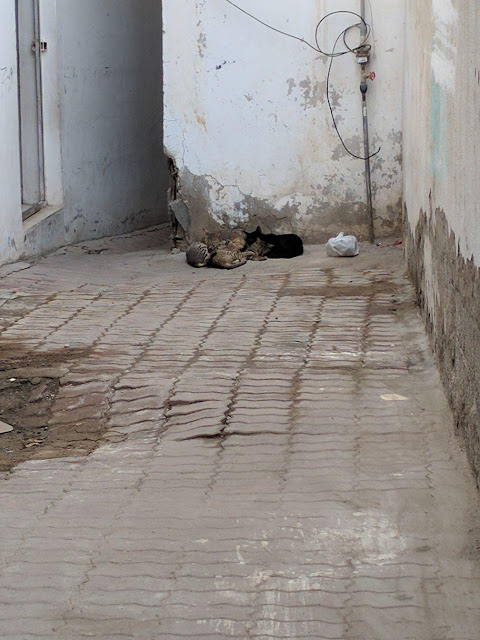
Exercise 6- Texture in photography:
This photo was capture to show how coarse texture is the wall, and how the cats has soft fur texture, it was sunset time so the sunlight was softly illuminate, I kept the photo color to show the real texture, because the white color will hide the wall texture.
Exercise 6-Definition :
Sunday, 12 February 2017
Exirsice5-Definition:
 |
| 1 2 3 |
SPACE: Is the empty or open area between, around, above, below, or within objects shapes and forms are made by the space around within them.
1- https://www.google.ae/url?sa=i&rct=j&q=&esrc=s&source=images&cd=&cad=rja&uact=8&ved=0ahUKEwid4Zm8rIvSAhVJbBoKHa1oBcwQjRwIBw&url=http%3A%2F%2Fkirstenho.weebly.com%2Fcritique.html&bvm=bv.146786187,d.bGs&psig=AFQjCNEn__3uW4RFbmkAFVLCN7guezuGIw&ust=1487016014631594
2- https://www.google.ae/url?sa=i&rct=j&q=&esrc=s&source=images&cd=&cad=rja&uact=8&ved=0ahUKEwih6qqurYvSAhXBWhoKHT2WCakQjRwIBw&url=https%3A%2F%2Flintula.wordpress.com%2F2008%2F10%2F23%2Felements-of-design-value%2F&bvm=bv.146786187,d.bGs&psig=AFQjCNEn__3uW4RFbmkAFVLCN7guezuGIw&ust=1487016014631594
3- https://www.google.ae/url?sa=i&rct=j&q=&esrc=s&source=images&cd=&cad=rja&uact=8&ved=0ahUKEwjjsve9rYvSAhVJuBoKHWLcCckQjRwIBw&url=https%3A%2F%2Fartandotherimages.wordpress.com%2F2013%2F06%2F10%2Felements-of-the-architectural-space%2F&bvm=bv.146786187,d.bGs&psig=AFQjCNEn__3uW4RFbmkAFVLCN7guezuGIw&ust=1487016014631594
Exercise5-Illusion of Space in Art:
The columns connect near the center of the painting. The smaller the columns become the further they are, this also applies on the people. Overlapping was used as well. For example, sine of the painting are over the ceiling and the wall, this means that they are in front of them.The atmospheric perspectives was also applied in this painting the columns, people and the wall farther back are more.
Sunday, 5 February 2017
Saturday, 4 February 2017
Saturday, 28 January 2017
Exercise 3- Definition.
 |
| 1 2 3 |
1- https://www.google.ae/url?sa=i&rct=j&q=&esrc=s&source=images&cd=&cad=rja&uact=8&ved=0ahUKEwjl4sfr3OXRAhXI1hQKHYUUDt0QjRwIBw&url=https%3A%2F%2Fwww.pinterest.com%2Fexplore%2Fabstract-art-images%2F&bvm=bv.145822982,d.ZGg&psig=AFQjCNGgOOuii6Zk3jZHZyr5BpR16iMeYQ&ust=1485723319077294
2-https://www.google.ae/url?sa=i&rct=j&q=&esrc=s&source=images&cd=&cad=rja&uact=8&ved=0ahUKEwj7h5qe4uXRAhUFzxQKHSiDCKgQjRwIBw&url=%2Furl%3Fsa%3Di%26rct%3Dj%26q%3D%26esrc%3Ds%26source%3Dimages%26cd%3D%26cad%3Drja%26uact%3D8%26ved%3D0ahUKEwj7h5qe4uXRAhUFzxQKHSiDCKgQjRwIBw%26url%3Dhttp%253A%252F%252Fwww.pinterest.com%252Fpin%252F217369119486810653%252F%26psig%3DAFQjCNEXski9Y5GRn62vq3MYe1A6k3LLQA%26ust%3D1485724634327142&psig=AFQjCNEXski9Y5GRn62vq3MYe1A6k3LLQA&ust=1485724634327142
3-https://www.google.ae/url?sa=i&rct=j&q=&esrc=s&source=images&cd=&cad=rja&uact=8&ved=0ahUKEwj1jaf75eXRAhVJOBQKHZkmCf0QjRwIBw&url=https%3A%2F%2Fcuratedhams.wordpress.com%2Ftag%2Fcornell-university%2F&bvm=bv.145822982,d.d24&psig=AFQjCNEaIGgOQx8Vfwg024cGndhTXdlguA&ust=1485725086608390
Exercise 3 - Shapes in Logos.
 |
This is NIKE logo, they use it on Nike sport brands .The meaning behind Nike logo is to suggest movement ,because it represents the wings of Greek goddess of victory .Whenever i see Nike logo it make me feel i can do my best and reach my goals .Nike logo cheers you up and gave you a power .When you see Nike logo you automatically know its a sport place ,because its a sport brand .
Monday, 23 January 2017
Subscribe to:
Comments (Atom)


