Sunday, 26 February 2017
Saturday, 25 February 2017
Sunday, 19 February 2017
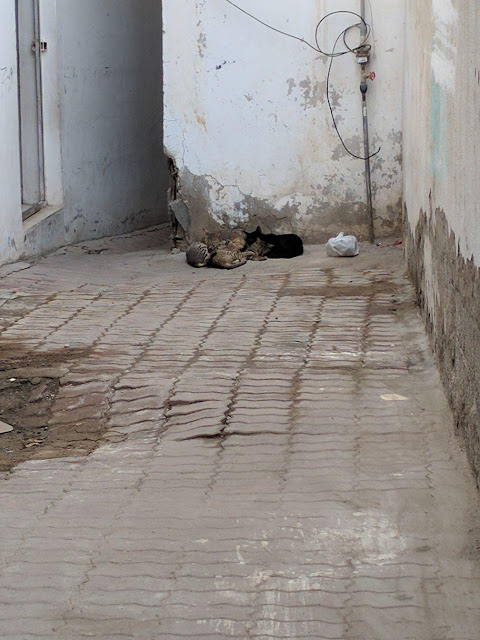
Exercise 6- Texture in photography:
This photo was capture to show how coarse texture is the wall, and how the cats has soft fur texture, it was sunset time so the sunlight was softly illuminate, I kept the photo color to show the real texture, because the white color will hide the wall texture.
Exercise 6-Definition :
Sunday, 12 February 2017
Exirsice5-Definition:
 |
| 1 2 3 |
SPACE: Is the empty or open area between, around, above, below, or within objects shapes and forms are made by the space around within them.
1- https://www.google.ae/url?sa=i&rct=j&q=&esrc=s&source=images&cd=&cad=rja&uact=8&ved=0ahUKEwid4Zm8rIvSAhVJbBoKHa1oBcwQjRwIBw&url=http%3A%2F%2Fkirstenho.weebly.com%2Fcritique.html&bvm=bv.146786187,d.bGs&psig=AFQjCNEn__3uW4RFbmkAFVLCN7guezuGIw&ust=1487016014631594
2- https://www.google.ae/url?sa=i&rct=j&q=&esrc=s&source=images&cd=&cad=rja&uact=8&ved=0ahUKEwih6qqurYvSAhXBWhoKHT2WCakQjRwIBw&url=https%3A%2F%2Flintula.wordpress.com%2F2008%2F10%2F23%2Felements-of-design-value%2F&bvm=bv.146786187,d.bGs&psig=AFQjCNEn__3uW4RFbmkAFVLCN7guezuGIw&ust=1487016014631594
3- https://www.google.ae/url?sa=i&rct=j&q=&esrc=s&source=images&cd=&cad=rja&uact=8&ved=0ahUKEwjjsve9rYvSAhVJuBoKHWLcCckQjRwIBw&url=https%3A%2F%2Fartandotherimages.wordpress.com%2F2013%2F06%2F10%2Felements-of-the-architectural-space%2F&bvm=bv.146786187,d.bGs&psig=AFQjCNEn__3uW4RFbmkAFVLCN7guezuGIw&ust=1487016014631594
Exercise5-Illusion of Space in Art:
The columns connect near the center of the painting. The smaller the columns become the further they are, this also applies on the people. Overlapping was used as well. For example, sine of the painting are over the ceiling and the wall, this means that they are in front of them.The atmospheric perspectives was also applied in this painting the columns, people and the wall farther back are more.
Sunday, 5 February 2017
Saturday, 4 February 2017
Subscribe to:
Comments (Atom)


